We live in an unprecedented era of customizability of physical goods and services. One problem that still appears relatively unsolved is the proliferation of settings. I will speak about software, since it’s the domain I’m more familiar with. Many could argue, this is a problem only if your application doesn’t have good UX. Most settings will be toggled once and forgotten., it doesn’t make sense for them to be at the forefront of your app. More than 95% of your application configurability should remain in the settings section, but describe them.
My most recent terrible settings experience was when I was trying to set up the HDMI-eARC connection for my amplifier with my TV, so the amplifier turns on/off together with the TV. It involved a lot of educated guessing until I ended up with the right configuration. What’s the difference between Standby Through and Standby Sync, no description whatsoever. Two months later, a software update reset my settings and had to reconfigure them again, not a great experience. When is the last time you’ve referred to the printed manual you got with an appliance?
I’ll use examples from operating systems, since they have to cater to both the average user and the power user. Getting settings right is a devilish exercise, be it Windows, iOS or Android.
Who is doing it right
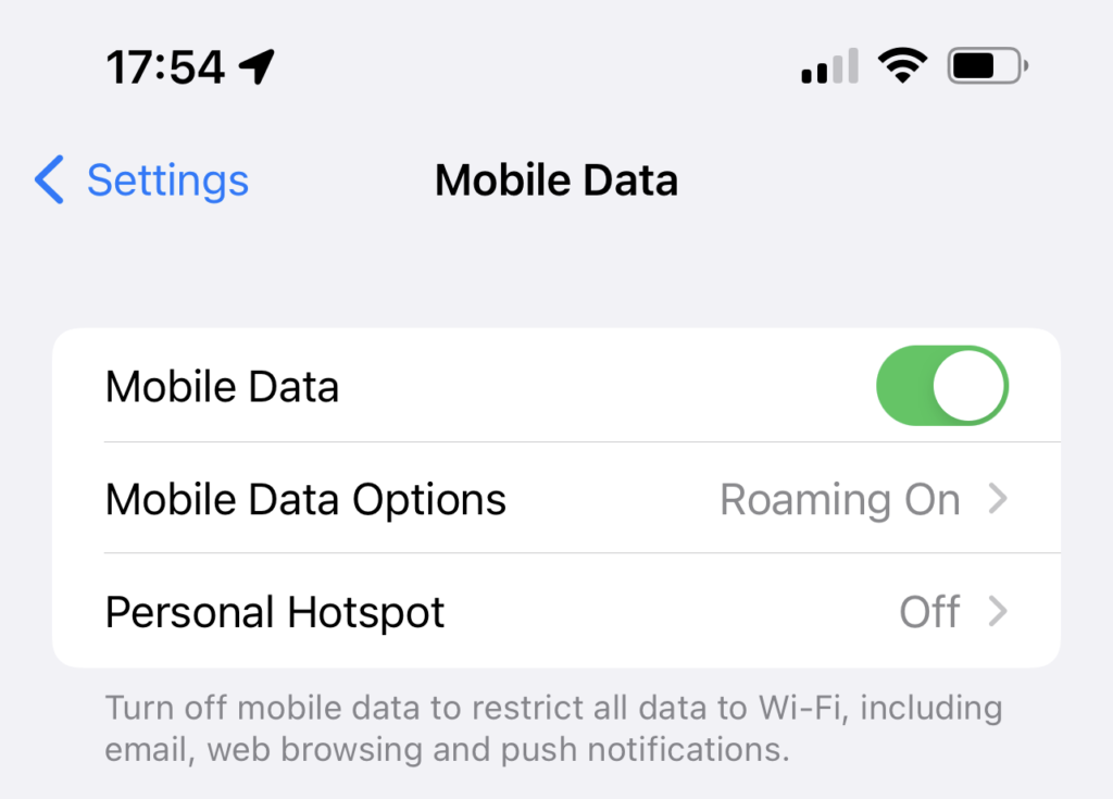
Apple in iOS, for the better part of it. The mobile data toggle despite being an obvious setting is described nicely and located close enough to the toggle that prompts you to read it. It has the right amount of detail without getting overly technical. A general use case setting, should have a simple explanation.
Settings for power users, require more details. Let’s look at Windows 10 as an example:
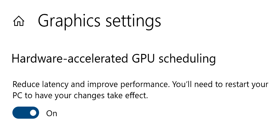
As a technical person, I’d consider myself a power user of Windows. I have a high level understanding of what GPU scheduling is. Nonetheless, this description is far from helpful, since depending on your GPU/CPU configuration it could deteriorate your computer’s performance. It doesn’t need a 100 word paragraph, but more details here would have been greatly appreciated, or at least a link to read more. Picking on the Settings panel in Windows is easy, since it includes UX paradigms from Windows 95. It’s a mess, since configurability is spread out between the Settings app, the Control Panel and random configuration menus. For the really advanced power users, we have the Registry Editor (regedit), but I’ll ignore its use case, since it falls out of scope for this post. No wonder Microsoft are finally trying to tidy things up in Windows 11. That’s the price of backwards compatibility and keeping existing users happy.
Is search the answer
Let’s take a look at Android’s settings. In terms of visuals it’s closer to iOS, but the search is a bit better. People go to the settings menu to fix an annoyance. Support for natural language input in the search bar would be nice. For example: “Disable notifications for App 123” should be able to take you directly to that toggle. I should give credit to Google for hiding the Developer’s settings. Revealing them usually requires a funny number of taps on the version item in the About section, a nod to power users.
Conclusion
Whatever your UX paradigm is, describe your settings. How you approach it is your choice, be it small labels, tooltips, links for extensive reading, even videos if it’s that advanced of a setting. Nobody refers back to the tiny booklets when they purchase a new phone or an appliance, they would just do an internet search and hope someone in a forum has explained it. Settings are usually an overlooked place of any application, riddled with complexity and confusing choices. Take a step in the right direction by improving the settings in your application.


0 Comments