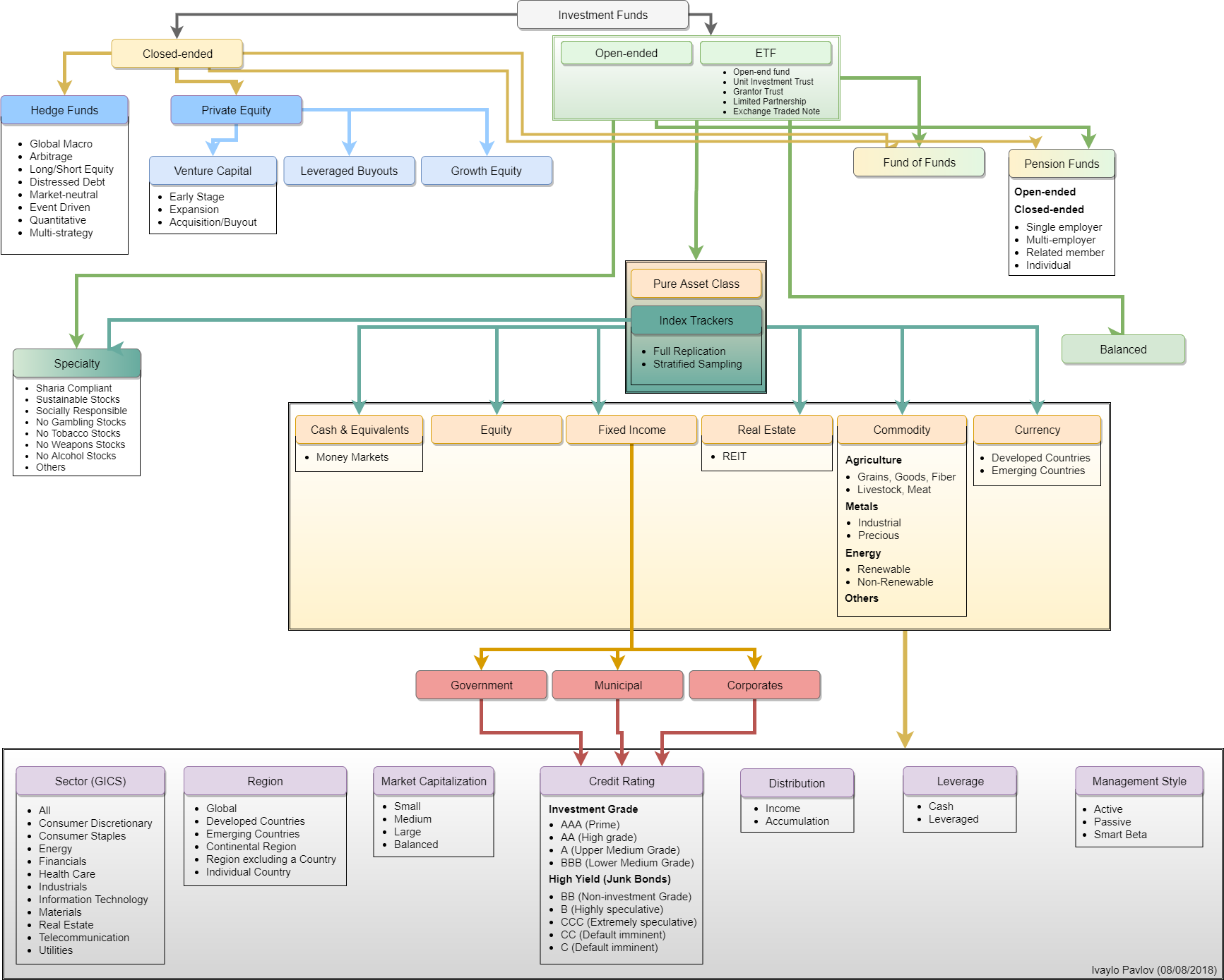
Originally this post was about to be explaining all investment fund types and their differences so I created the diagram above after a month of research. After writing more than 15 000 words and being under half of what I intended to write, I realized you, as a reader, are better off reading a textbook on the topic. So I narrowed the post to the mathematical side of things – the investment fund metrics & their pitfalls. The post starts with the absolute essentials and progresses to slightly lesser known ratios. The post is intended to be read from beginning to end, at the very least you should read the first 3 as they are the absolute must-know and then you can skip to the ones of interest.
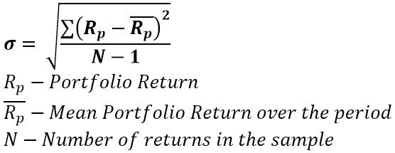
Also known as Standard Deviation, is a just a square root of the variance and is a standardized metric of dispersion of the returns. It’s the backbone of financial risk measurement and the majority of financial ratios. The value by itself is not as useful. Its primary use is for comparison and normalization of other metrics.
Pitfall #1: Interpretation is strightforward – higher value, means higher risk. The possible pitfall is incorrect comparison across a universe of securities – a high value is only meaningful when you compare funds that have similar characteristics or focus on the same segment. The volatility of a small cap technology stocks fund will always be higher than that of large cap utilities one (all things as usual).
Pitfall #2: Skewing the number by playing with the periodicity. Having infrequent prices of certain assets or using interpolated or custom-derived prices. As you can see by the formula above, if you reduce the periodicity from weekly to quarterly, and you have relatively stable prices at the end of the quarter you will get very low volatility number, even though in the middle of every quarter price movements might be crazy, but you won’t see it. Alternatively, if you go for a daily, as it’s too many data points, you will include a large amount of noise, and show that you might be more volatile than in reality. Some times you don’t have a choice, if the assets are illiquid and get priced once a quarter. It could play just as well in reverse – a spike at the end of the month and stable during the rest of the month will overestimate the volatility. Usually the preferred one is weekly, because this value will be used in other ratios, which will inforce to follow the same periodicity as for the numerator. In reality there is no golden rule for the period and it’s on a case by case basis.
Pitfall #3: High value for the wrong reasons. As the formula doesn’t differentiate between positive and negative values, due to the squaring. You will get a high value even for large positive return movements. There are other metrics created that filter out only the negative ones.
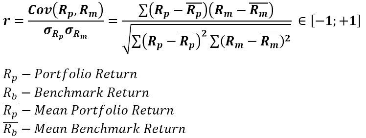
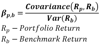
Correlation shows how strongly the returns for two assets move together. It’s bound between -1 and 1. -1 Means if Fund A moves 1% up, Fund B should move 1% down. A value of 1 means they should move in perfect unison in the same direction. A value of 0, means no relationship at all. Beta shows the sensitivity of one security versus another. For 1% change in Fund A, it’s expect to move Fund B, by Fund A return multiplied by beta.They are useful as part of others metrics which are used for security selection and diversification purposes.
Pitfall #1: The values are based on averages, this means they are expected to behave like this on average, so you won’t see these perfect moves, just described above, in real life.
Pitfall #2: High level of correlation, doesn’t mean causation. Known as Spurious correlation in the econometrics world. If two things look correlated, it doesn’t mean they actually are. It’s just numbers, so something highly correlated today, might be completely uncorrelated tomorrow.
Pitfall #3: Replication strategy selection. A fund using optimizated security selection to track vs the full replication approach will show in the correlation value.
Pitfall #4: Skewing the number by playing with the periodicity as described above for volatility.
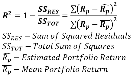
R-Squared, as you can guess by the name is the correlation value squared. It produces a value between 0 and 100. It shows how well the fund tracks the benchmark. In its pure econometrics meaning, it’s the percentage variance explained by the estimator. In this case the percentage amount of fund price returns, explained by the returns of the benchmark. It is not a proxy for performance. A low R-squared is possible for many reasons, lag in prices due to different trading hours and replication strategy, all covered in the correlation section.
Pitfall #1: All points for correlation.
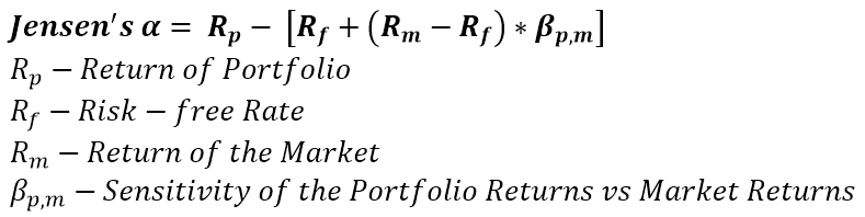
This is the excess return over what is considered expected return based on the beta for the stock. It’s what everyone in the industry is looking for. For alpha to exists, it means there is a mispricing happening somewhere. The concept of Alpha is that it’s an ephemeral value as people exploit the mispricings causing its existence, it should converge towards 0.
Pitfall #1: Everything about beta calculation.
Pitfall #2: Selectiveness of the Risk-free rate, as described for Sharpe & Treynor Ratio.
Pitfall #3: Selectiveness of the universe for the market return, it must be the same universe used to calculate the fund beta. The index selection can be based on style, broader segment, etc.
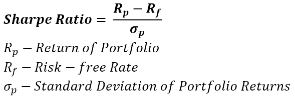
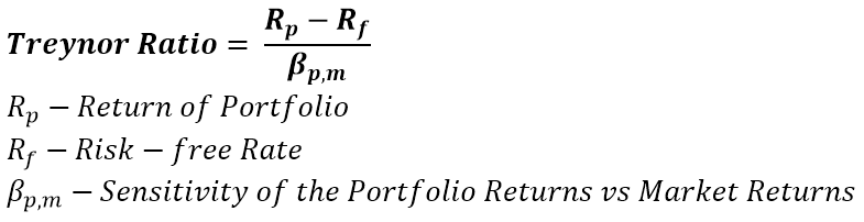
It’s the excess return over the risk-free rate divided by the volatility for Sharpe and divided by the beta for Treynor. The value by itself means nothing, it’s intended for comparison. Higher value is better.
Pitfall #1: The selection of the risk-free rate. Usually it’s the US Treasury Rate. Sometimes, some might consider it being the German bund, as the fund is a domiciled in Germany or because it invests in German stocks. It should be the lowest considered risk-free rate you have access to. If for some reason you can’t invest in US Treasuries or it has to be EUR denominated rate, such changes are justified. Do not always assume it’s the US Treasury, even though it most likely is.
Pitfall #2: Skewing the volatility and beta. Refer to the volatility pitfalls.
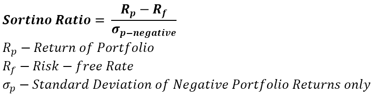
The same as the Sharpe Ratio, but excluding the “penalty” for having positive returns when the volatility is calculated.
Pitfall #1: The selection of the risk-free rate. Usually it’s the US Treasury Rate. Sometimes, some might consider it being the German bund, as the fund is a domiciled in Germany or because it invests in German stocks. It should be the lowest considered risk-free rate you have access to. If for some reason you can’t invest in US Treasuries or it has to be EUR denominated rate, such changes are justified. Do not always assume it’s the US Treasury, even though it most likely is.
Pitfall #2: Heavily skewed distrubution of positive vs. negative returns. For example, if in a sample of 52 returns, you have only 5 negative large drops and 47 small and steady positive returns, the Sortino will exageratte the reality. Which is why it’s good to always combine it with the Sharpe ratio, as you get a slightly more nuanced picture.
Tracking Error & Information Ratio
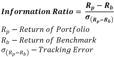
Tracking Error is a quintessential metric in Portfolio Management. Lower is better. It’s important to bear in mind that as we are doing the volatility calculation of a spread of percentage returns, the value are so small, that even mediocre differences can cause a large tracking error. The period over which it is calculated is as important as for all previous metrics. It can be used by itself, but it’s more commonly used to compare funds that track the same or similar indices, assuming they are all passive. It also serves the purpose to show different replication strategies, like full replication and optimization and what is the precision loss by having a cheaper optimized holdings fund.
Information Ratio, follows Sharpe & Treynor in its base idea, just substitutes the denominator with the tracking error. It’s interpreted as the Active Return you receive for a unit of volatility. Higher is better.
Pitfall #1: In theory you can benchmark all fund types on it – active, passive, semi-active. However, there is a tendency for semi-active funds to have the highest IR. As they are geared toward tracking the fund, so they focus on very low tracking error and on tiny weight difference bets to outperform the benchmark. It’s practical to compare them by individual groups – active, passive, semi-active, as each has a “skew” reflecting the risk-taking associated with the type. For example, you wouldn’t really compare a full active management absolute returns fund with a smart beta ETF. The ETF has a much better predisposition for a high IR ratio. Doesn’t mean it’s the better one.
Pitfall #2: Everything for Sharpe Ratio.
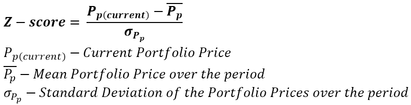
It’s a standardized metric that show how far in standard deviation terms the value is from the mean.
Pitfall #1: Assumes a Normal Distribution. In heavily skewed returns distribution, it’s not very useful. You can get in such a situation in a trending market in either direction.
Pitfall #2: Time-frame selection, as for volatility discussed earlier.
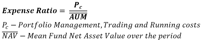
The ratio approximates the operating costs for the fund. It will vary greatly on the fund type, strategy, focus, market liquidity, etc. For example, trading costs for emerging market securities will always be greater than for a developed market like the US, so compare wisely. As it has the Assets Under Management in the denominator, it favours large funds that have achieved economies of scale.
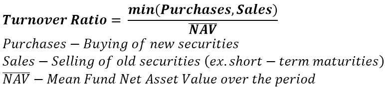
The ratio shows how much change there is in the underlying holdings of the fund portfolio. It is accepted lower is better, as it translates into smaller trading costs and lower running expenses.
Pitfall #1: It is heavily influenced by the strategy of the fund – tactical (short-term focus and frequent rebalancings) or strategic (long-term focus and fewer rebalancings). If you are looking at a tracker fund and the turnover ratio is quite far from that of the index, it should raise questions. Compare it wisely across fund types – active, passive, semi-active. As active funds will generally have higher turnover ratio than a passive ETF.
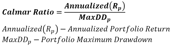
Maximum Drawdown & Calmar Ratio
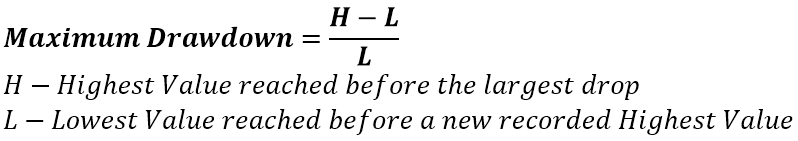
Maximum Drawdown calculates the worst case scenario you could have achieved for a given time frame. As it assumes entering at the highest high and exiting at the following lowest low. It’s considered a resilience metric.
Pitfall 1: The time frame used to for generating the Maximum Drawdown value and the return period for annualization. Beyond that it’s tought to game this metric.
Upside & Downside Capture Ratios
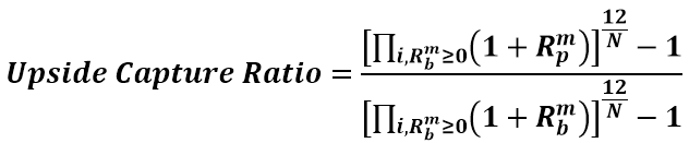
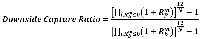
The two ratios show if the fund outperformed the benchmark during periods of positive and negative returns. The examples above assume monthly period returns, thus the 12/N period at the top. If it’s weekly periodicity, it will be 52, etc. The formulas might look a bit overwhelming, but are quite simple to break down and are always used together. Along with the Maximum Drawdown, the downside capture ratio is considered a resilience metric.
Pitfall #1: Heavily influenced by the amount of leverage in the fund. By amplifying the fund returns vs. the benchmark it will overblow either of the two numbers.
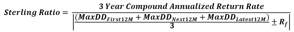
The Sterling ratio shares a similar idea as the Calmar Ratio above, but it accounts that the largest historical drawdown is not the largest possible maximum drawdown. At the denominator, if the MaxDD value you calculate is negative, then add the Risk-free Rate, if it’s postitive – add it. The value was originally 10%, the Risk-free rate during the times when it was invented. Some substitute it with other rates, such as LIBOR or Swap’s curve. The ratio falls under the more “exotic” ones. It’s highly unlikely you’ll see it quoted in many places.
Pitfall #1: Everything for Maximum Drawdown and the Calmar Ratio.
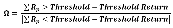
It’s calculated by summing the historical returns above the return threshold minus the threshold itself (usually either 0 or the risk-free rate) and dividing them by the absolute value of the sum of returns below the threshold minus threshold return. It gives the likelyhood of achieving the threshold return. Higher value, means better odds of achieving the return. As it doesn’t use standard deviation, it’s advantage is usuability on non-normally distributed return series.
Other Complicated Metrics
The above equations can be combined in many ways with other information to produce custom complicated metrics. As everything else, to understand the risks, breaking apart the final formula into its basic units will reveal the main sources that could skew it. Be always mindful of numbers, they cannot interpret the complexities of real-life perfectly and they are all suspectible to bias as described above.
The Final Pitfall
In closing statement, I’ll focus on the final trap – the one of overcomplicating things. Analytical people are prone to fall into that one, so try to balance out complexity vs utility. Always try to be as transparent as possible about the numbers. Bring as much context from outside as possible and always be wary of confirmation bias.
0 Comments