Let me start by saying I’m a visual learner, so I’ve always had an inclination towards UML graphs and charts.

So during one rainy day in London, I decided to aggregate the data from my Garmin Vivosmart HR, Apple Watch 2 and Yunmai Smart Scales in my Apple HealthKit app and come up with interesting aggregation statistics and chart that could provide an interesting insight to the data. It’s something basic, yet I haven’t found a good enough iOS app that does this type of analysis out of the box.

I’ll walk you through the steps you can do to get your data in the right format and then use the Jupyter notebook I’ve already built, so you can generate the same charts for yourself quickly or modify freely as you see fit.

The entire analysis is done in Python using basic libraries, such as pandas, numpy, matplotlib, seaborn in an interactive HTML notebook – Jupyter Notebook, which comes from the languages it originally supported (Julia, Python, R). It imitates a python shell in a browser and is the latest trend for reproducible research.

Collecting the data from your iPhone

There is a saying that goes – In Data Science 80% is cleaning the data and 20% is actually analyzing it. 
Assuming you have your data in HealthKit, you can download and install a free app called QS Access which will export a part of the data. For the remaining part, we’ll use this website – http://ericwolter.com/projects/health-export.html that converts the raw XML HealthKit file to readable separate CSVs.

The notebook needs very few files:


Exported from QS Access:
-Health Data-daily.csv 
-Health Data-intraday.csv
-Sleep Analysis.csv
Exported from the website:
-HKQuantityTypeIdentifierAppleExerciseTime.csv
-HKCategoryTypeIdentifierAppleStandHour.csv

Once you install the QS Access app, give it access to your HealthKit data and then select 1 Hour and tick all possible columns, I know, you’ll have many of these empty, but the code will clean up the empty columns, so nothing to worry about. Then click Create Table, you don’t have to wait to get the table displayed, as it’s too much data, so click on the export icon at the bottom left and Save the file to your cloud storage provider of choice, or email the file to yourself.
Repeat the steps, but just switch the 1 Hour at the top 1 Day. Once you get the files on your computer, rename them to Health Data-daily.csv and Health Data-intraday.csv respectively.
In the same app, scroll to the very bottom and click on Sleep Analysis then on Tabulate Sleep Analysis, again using the export icon save the file.
Now, open the HealthKit app and tap on the profile icon at the top right, then tap on Export Health Data. It will take a minute or two and again save/send it to yourself, leave it named export.zip. 

Next, go to your computer and extract the archive contents and open the website – http://ericwolter.com/projects/health-export.html and click on the rectangle and select the exported export.xml.

when completed click on the HKQuantityTypeIdentifierAppleExerciseTime.csv and HKCategoryTypeIdentifierAppleStandHour.csv to download them.
You are done! Get all the 5 files in the same folder, doesn’t matter where.

Jupyter Notebook Setup

Irrespective of platform, you will need to install Python with its most popular libraries, the fastest way is to download and install Anaconda from Continuum.
To download my notebook, you can open https://github.com/ivailop7/Health-Data-Analysis and click on Clone or download at the top right then on Download Zip, extract the archive.
(If you are familiar with Git & GitHub, you can git clone respectively.) The default is my data, so you can now copy your 5 files into the folder and overwrite mine. The last step is to rerun the script and recalculate and plot the charts. 
Open the Anaconda installed Startup Application and open a Jupyter Notebook instance.
  
Navigate to the extracted folder with the script and then click on the Restart button at the top
wait for a minute or two and it will regenerate everything with your data. If you are familiar with python, edit away and come up with your custom metrics.

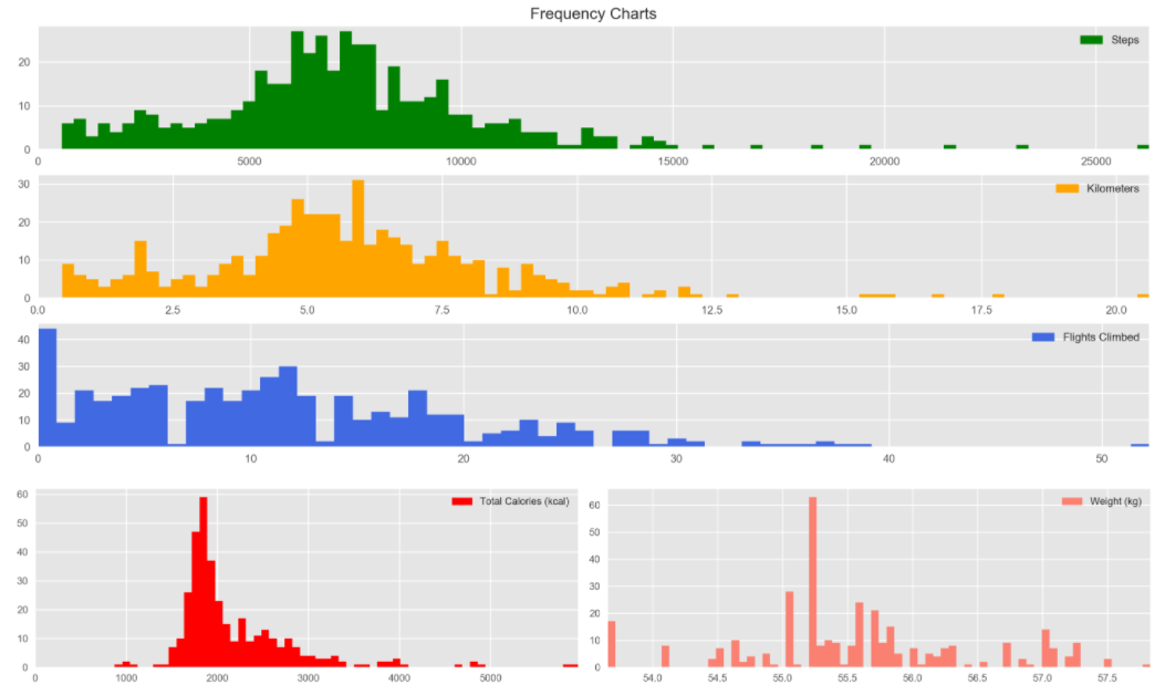
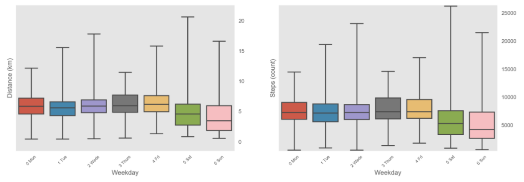
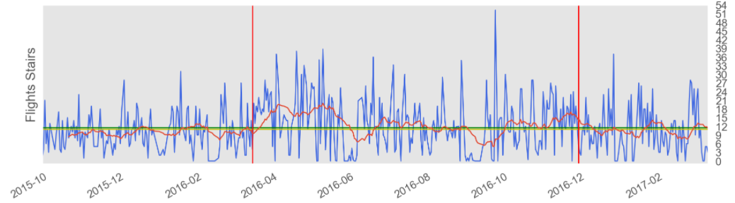
Here are some of the charts, you’ll get as an end result:

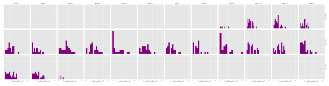
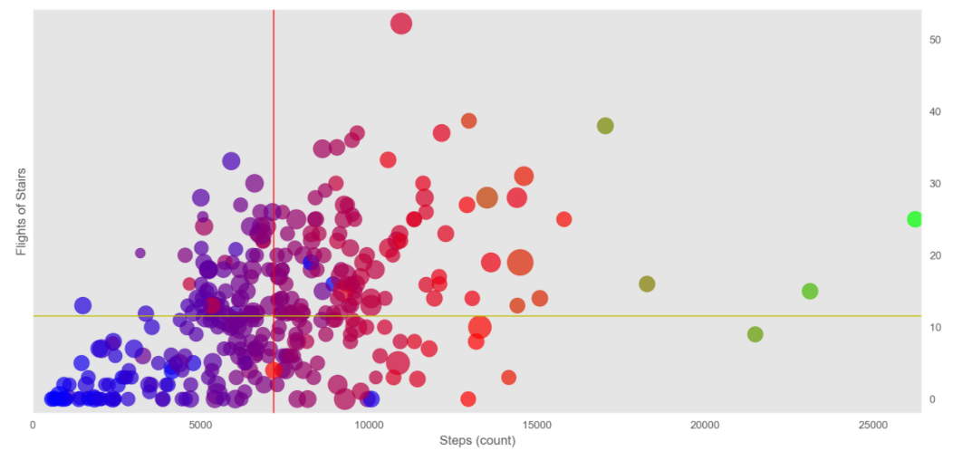
Distribution histogram of Steps, Kilometers, Flights Climbed, Total Calories, Weight

Hourly breakdown of average steps per week day
Boxplot of Distance and Steps per weekday
A Heatmap of Steps
Monthly distribution of Flights Climbed

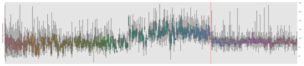
A Boxplot of daily heart rate
A scatter chart of Stairs by Steps with colored by Distance and size of the bubbles by Total Calories

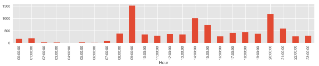
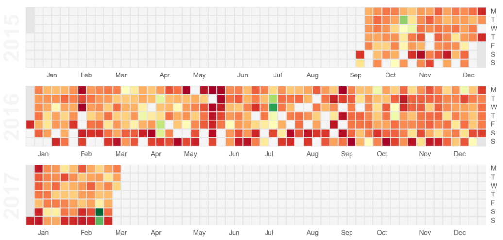
A standard timeseries chart for flights of stairs done
If you get ideas for improvement and interested in sharing, send me a message!

Ivaylo Pavlov

I blog about interesting tech, programming and finance in real life.

0 Comments

Leave a Reply